

Graphic Design Studio Work
A selection of projects from Sophomore Graphic Design Studio and Typography at Boston University, showcasing explorations in visual communication, typography, and design principles. Each piece reflects a balance of conceptual thinking and technical execution, emphasizing creativity, structure, and storytelling through design.
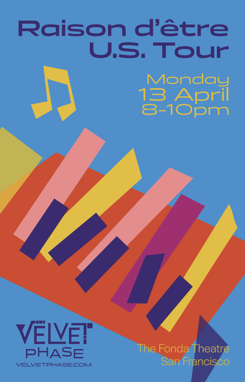
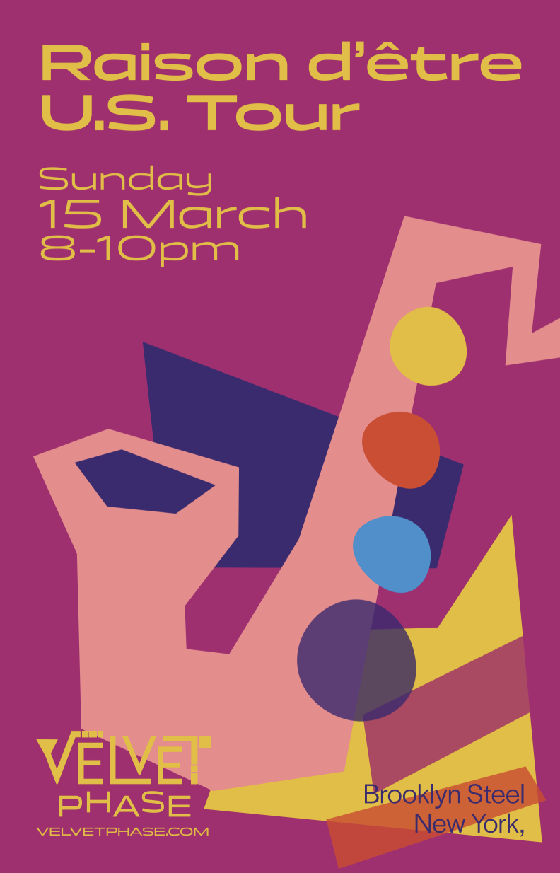
Velvet Phase Logo and Branding Design
Developed in collaboration with a group, this visual brand identity was created for Velvet Phase, a fictional contemporary jazz band targeting a younger audience. Led logo design and development of character visuals. The system features a bold, blocky composition and vibrant color palette, paired with illustrative elements that echo the personality of the logo. Deliverables included posters, merchandise, and stylized character designs for each band member—each piece contributing to a cohesive visual language that modernizes jazz through a fresh, youthful lens.


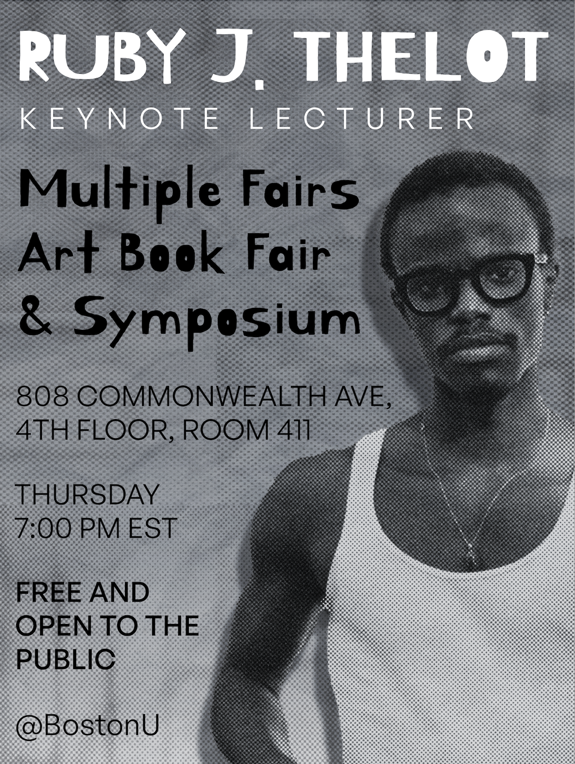
Ruby J. Thelot Keynote Lecture Poster
This poster and motion response for Ruby J. Thelot’s lecture draw from his conceptual, material-focused practice. Combining analog techniques with digital animation, the design features layered paper textures and organic movement to evoke a tactile, immersive feel.
Community Packaging Design
This project began with a single word—community—and evolved into a tangible packaging concept. The design focuses on the idea of building community through modular, stackable elements. Each piece houses a unique adjective that expands on what community means, emphasizing the diverse and interconnected qualities that make it whole.


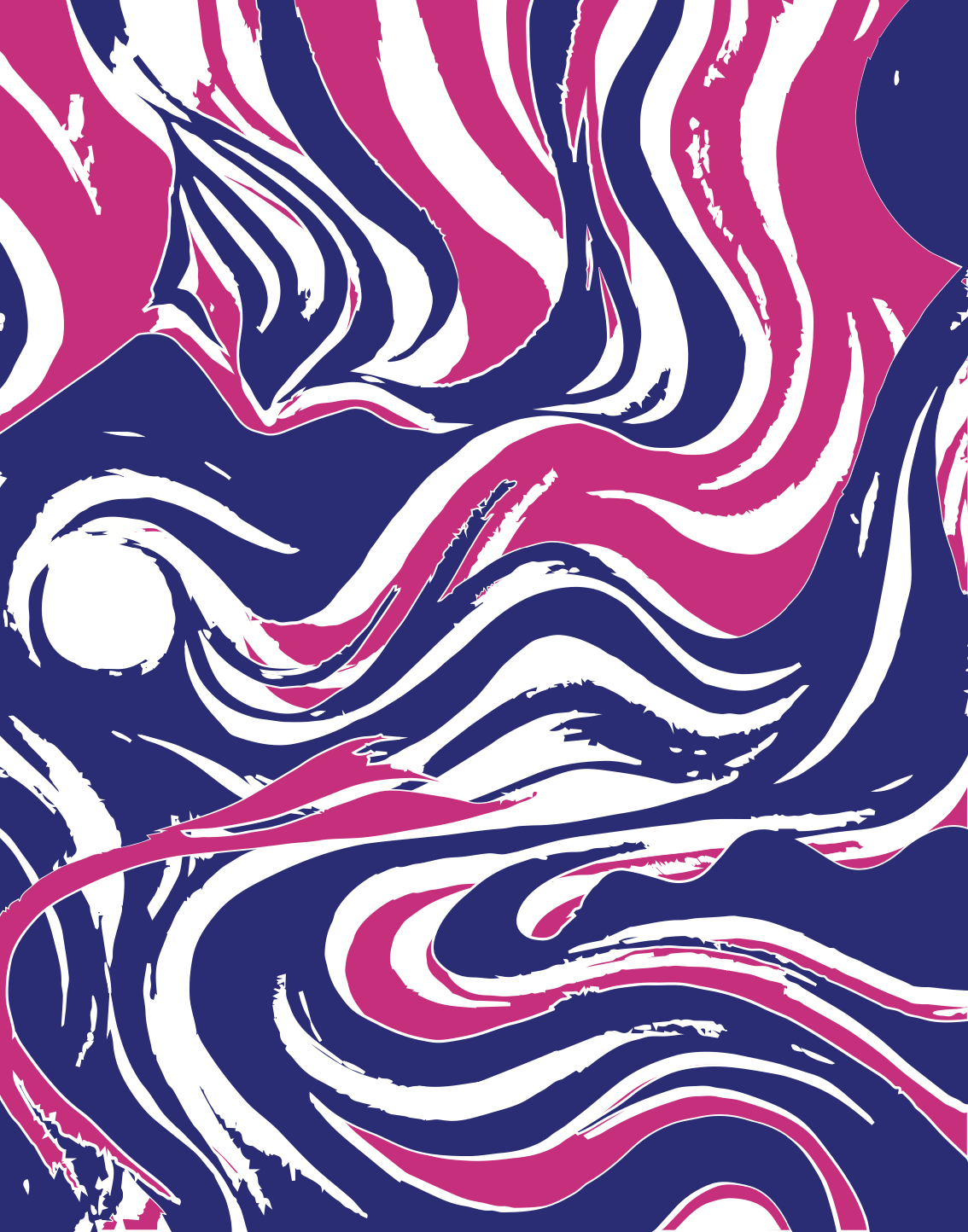
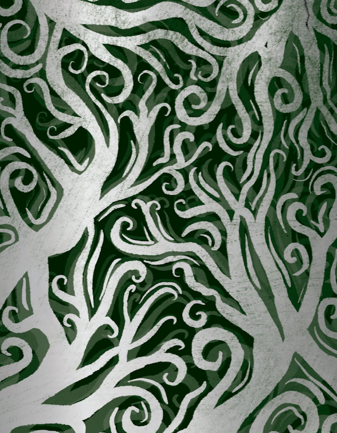
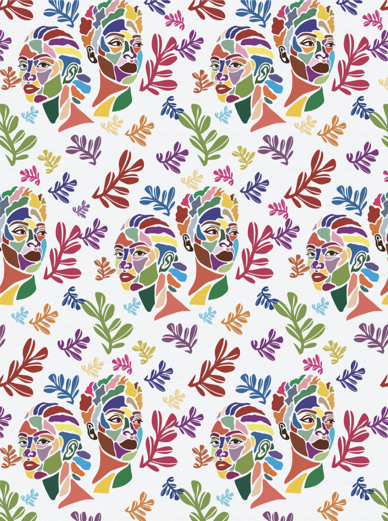
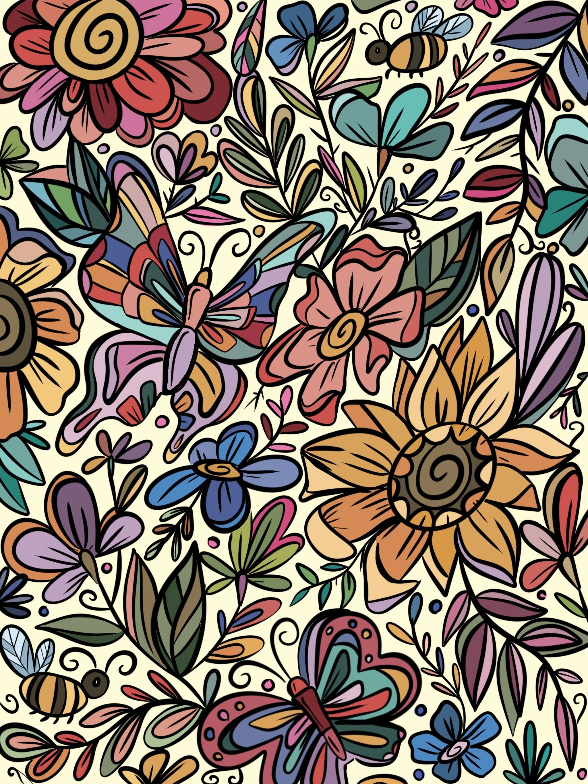
Pattern Design
This collection explores visual rhythm through patterns inspired by both natural elements and everyday motion. Each design plays with flow, repetition, and form to create dynamic compositions that feel alive and versatile across mediums.


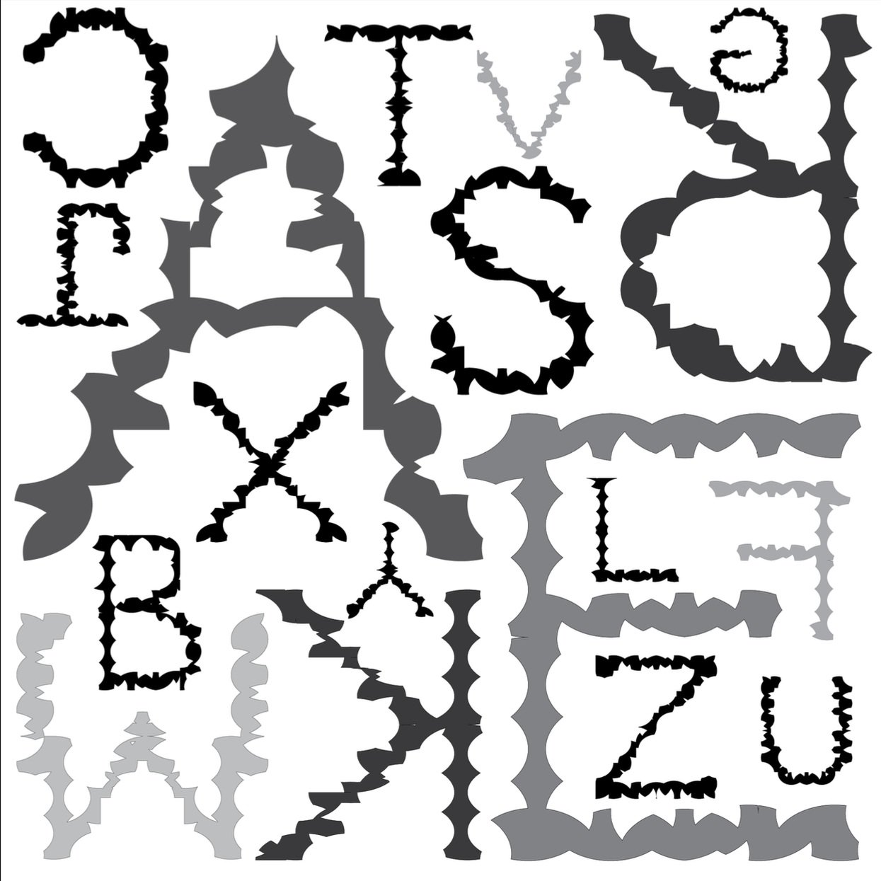
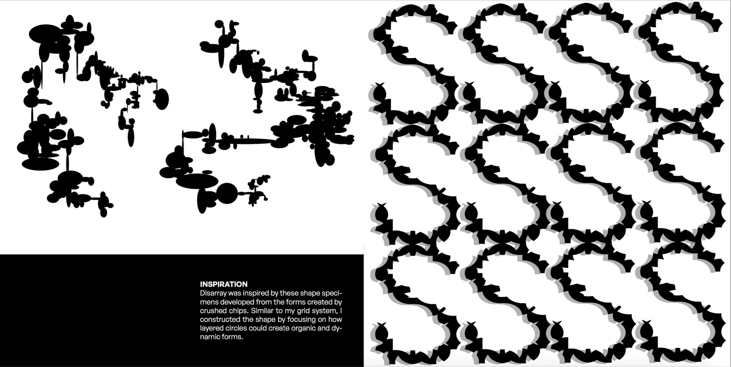
Letterform Design
Disarray is a typographic exploration rooted in a 3×4 square grid composed of repeated, overlapping ovals. By intentionally shifting alignment and symmetry, the grid embraces irregularity, producing fluid, organic letterforms. Inspired by the fragmented beauty of crushed chip shapes, the project draws from layered circular forms to create a system that feels both structured and spontaneous. The result is a dynamic alphabet that lives in the tension between geometry and chaos.


Shape Specimen Project
A visual exploration of dynamic forms and shapes derived from found objects and photography. These forms were reimagined and combined into compositions that reflect core design principles such as balance, contrast, rhythm, and unity.

